The main challenge was to sort, prioritize, and structure a large volume of information. Sustainability is a complex and sometimes technical subject, and the goal was to turn this research into something digestible, accessible, and engaging without oversimplifying it.
As sustainability was both the subject and the guiding principle, the color palette was deliberately kept minimal, allowing the booklet to be easily printed at home.
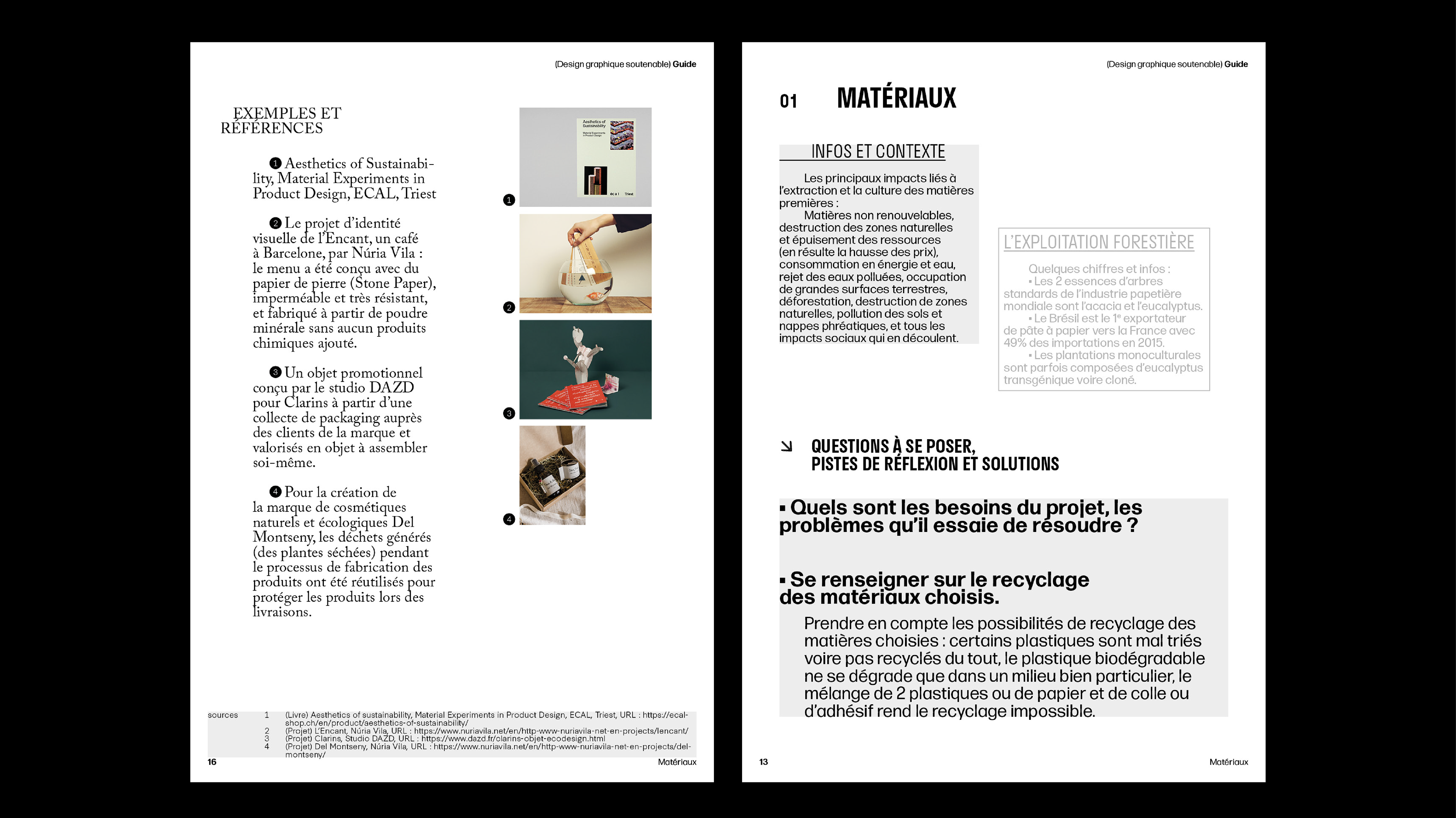
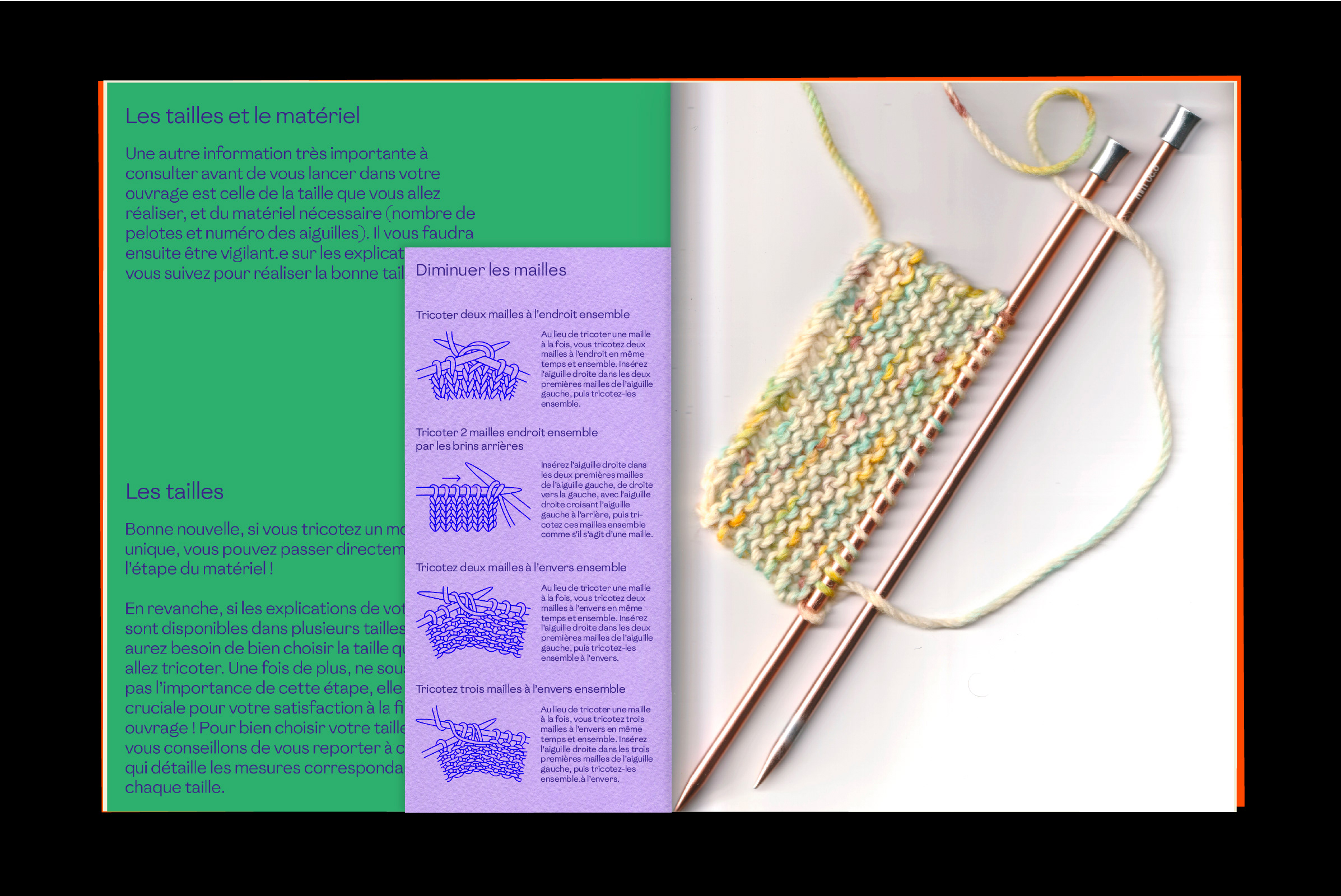
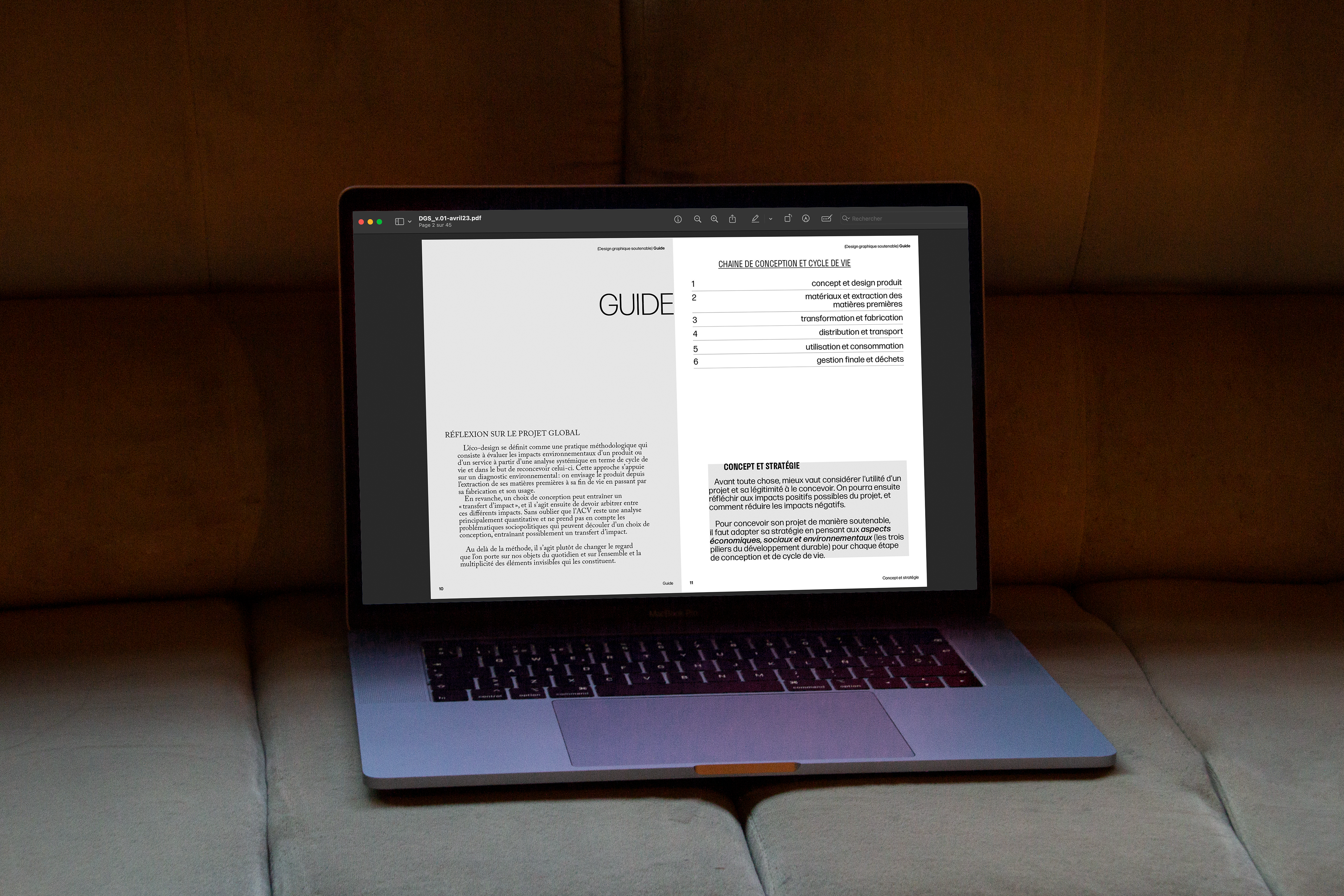
The overall aesthetic remains simple, structured, and functional, with a strong focus on readability and usability. Inspired by educational magazines for children, I adopted a compartmentalized approach to enhance clarity. Each chapter follows a consistent structure: explanations, key points, and examples, creating a format akin to a workbook. This makes the content easier to navigate and reinforces the idea of a practical, usable guide rather than a theoretical essay.